Behind the NATIONAL logo
Norman Wilson was a Manchester-based graphic designer whose work for the National Bus Company (NBC) in the early 1970s left a lasting mark on British transport history. Tasked with creating a cohesive corporate identity for the NBC, a nationalised bus company formed in 1969 to manage regional bus operations in England and Wales, Wilson developed a bold and modern visual system that aimed to unify the company’s diverse subsidiaries and revitalise its public image. Central to this rebranding was his iconic “double N” logo, a design that became synonymous with NBC and its National Express coach services for over three decades.
Early Life and Career
Details about Norman Wilson’s early life are sparse, as he maintained a relatively low public profile, and much of what is known comes from professional records and design archives. Born in 1931, Wilson was based in Manchester, a hub for industrial and creative activity in the UK. His training and early career likely exposed him to the modernist design movements of mid-20th-century Europe, including the Swiss Style, which emphasised clarity, simplicity, and grid-based layouts. By the 1960s, Wilson had established himself as a skilled graphic designer, founding Norman Wilson Associates, a design consultancy in Manchester.
Wilson’s early work included corporate branding for companies like Croda International, a Yorkshire-based chemical firm. His designs for Croda in the mid 1960s showcased his ability to integrate bold typography with photographic elements, earning international recognition. Notably, his Croda work was awarded a certificate of merit at the 1966 Typomundus 20 exhibition, a prestigious showcase of global graphic design. This accolade highlighted Mr Wilson’s growing reputation for creating cohesive and visually striking corporate identities, setting the stage for his later work with the NBC.
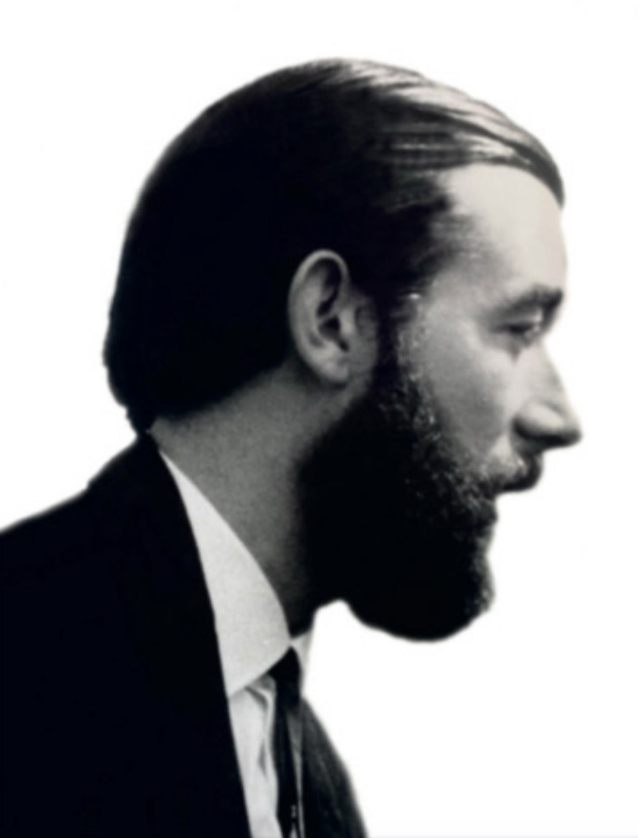 Norman Wilson
National Bus Company (NBC) Collaboration
Wilson’s collaboration with the NBC began in late 1971, when Sir Frederick Wood, the newly appointed NBC chairman, approached him to overhaul the company’s image. Wood, who had previously worked with Wilson at Croda International, valued his ability to craft clean, modernist-inspired designs. Wilson, through his firm Norman Wilson Associates, was known for his disciplined approach to corporate identity, emphasising bold colours, distinctive typography, and striking symbols.
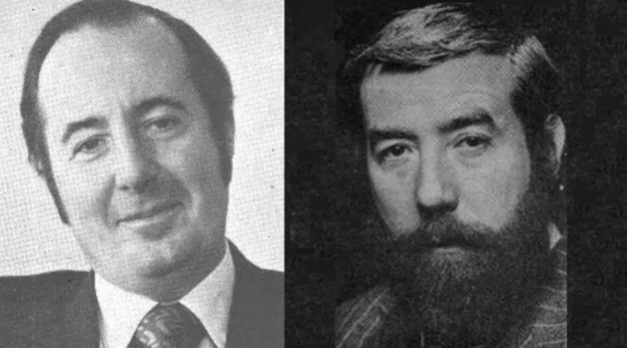 Sir Frederick Wood (left) and Norman Wilson (right). Photo courtesy of the Bus Archive/NBC Corporate Identity Project.
For the NBC, Wilson’s challenge was to create a unified brand for a national organisation with dozens of regional subsidiaries, each with its own long established traditional liveries and local pride. The goal was to project modernity and compete with the rising dominance of private car ownership, while fostering a sense of national pride and consistency across the company’s bus and coach services.
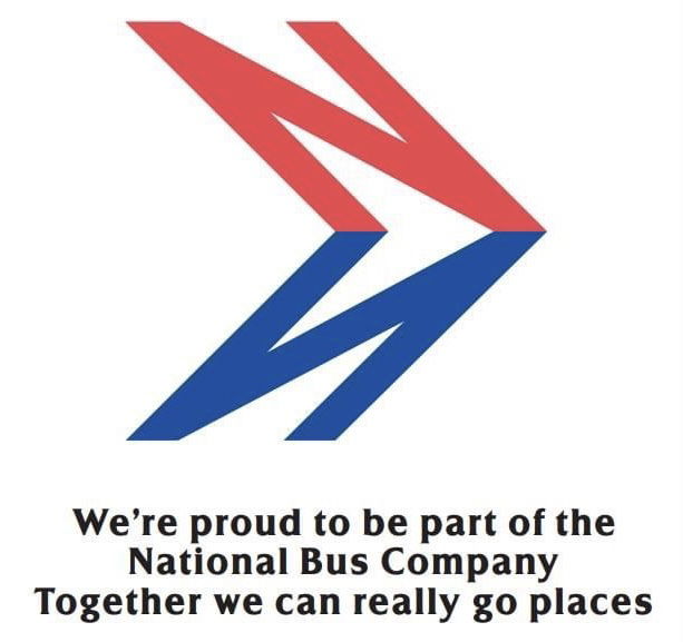
 A slogan from the era.
The Double N Logo
The centrepiece of Wilson’s design was the “double N” logo, officially described as a red italicised “N” with a blue shadow forming an arrow. Introduced in 1972, the logo was minimalist yet dynamic, symbolising motion and direction—qualities essential to a transport company.
The primary version featured a red “N” with a blue shadow, though it was also applied in monochrome white on buses, as well as signage and promotional material. The design was versatile, conveying motion and direction—fitting for a transport company—while being simple enough to be instantly recognisable. Wilson specified that the logo should point in the direction of travel on both sides of a vehicle, a detail that was corrected after an early trial where it pointed rearward on one side.
The logo’s design was rooted in Wilson’s modernist influences, drawing inspiration from graphic design principles like grid-based layouts and the Swiss typeface Akzidenz-Grotesk, which informed his bespoke “National” typeface.
 Another NBC slogan from the time featuring Norman Wilson’s double N logo.
NATIONAL Typeface
This typeface, used for the “NATIONAL” logotype and fleet names, featured alternating red and blue letters for coaches and white lettering for buses, ensuring a cohesive yet adaptable identity.
The typeface was inspired by modernist sans-serif fonts like Akzidenz-Grotesk with geometric features of Futura. This typeface was used for the “NATIONAL” logotype, fleet names, and other branding elements. On coaches, the logotype featured alternating red and blue letters, while bus fleet names were typically white. The typeface’s clean lines and readability ensured consistency across diverse applications.
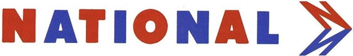 The NATIONAL name and logo.
Liveries and Colour Schemes
Wilson introduced bold, standardised liveries to replace the varied traditional colours of regional subsidiaries. National Express coaches adopted an unrelieved white livery, dubbed the “white coach,” with the double N logo and “NATIONAL” logotype prominently displayed. Local buses were painted in poppy red or leaf green, with white logos and fleet names. These colours were chosen for their vibrancy and modern appeal, though they faced resistance from operators accustomed to heritage liveries like East Yorkshire’s maroon or Oxford’s green and cream.
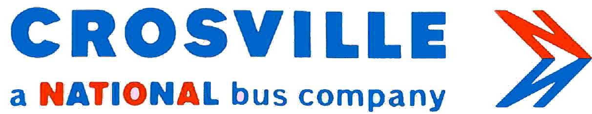 Each company within the NBC would use similar branding, confirming that they were a part of the National Bus Company.
 NBC Identity and Branding Applied to Crosville Vehicles
Here are examples of how the NBC branding and livery was applied to Crosville vehicles of the time.
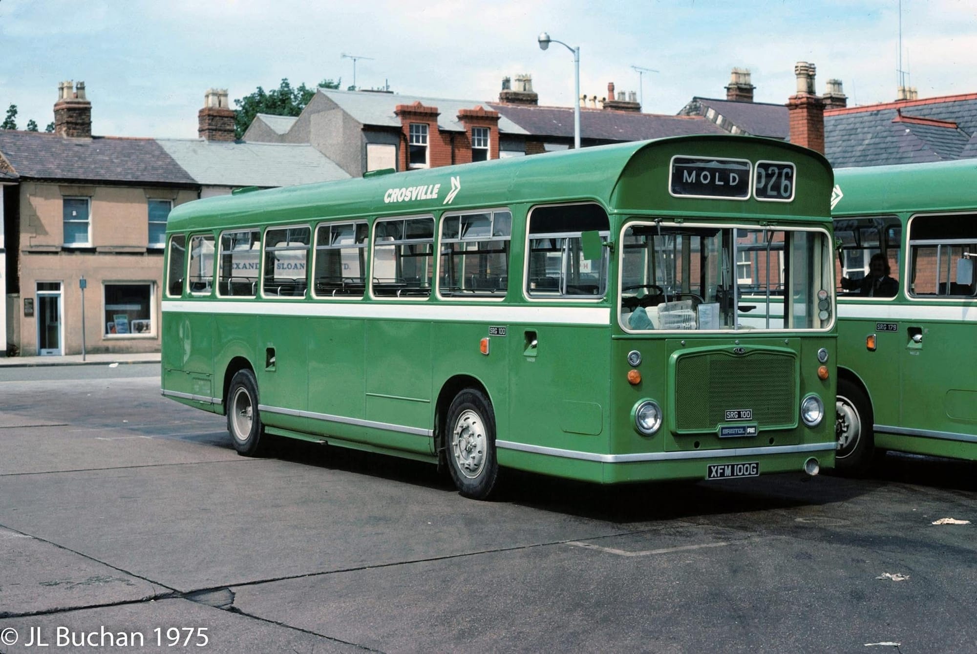 Crosville SRG100 (XFM 100G) is seen here in NBC bus livery, at King Street bus station in Wrecsam, July 1975.
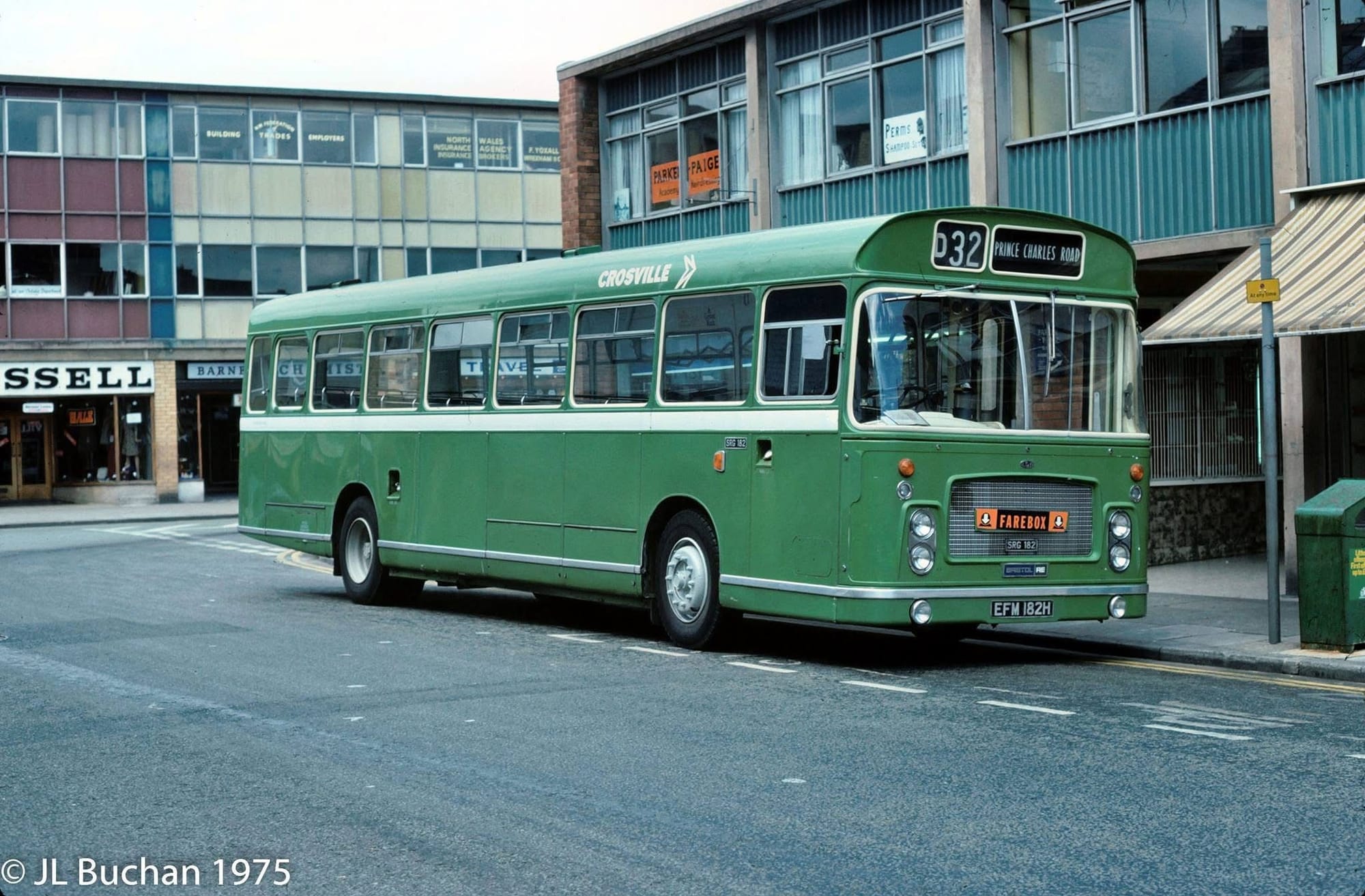 Crosville ECW/Bristol RELL, SRG182 is seen here at King Street, Wrecsam in July 1975 displaying the monochrome appearance of the NBC logo and company fleet name.
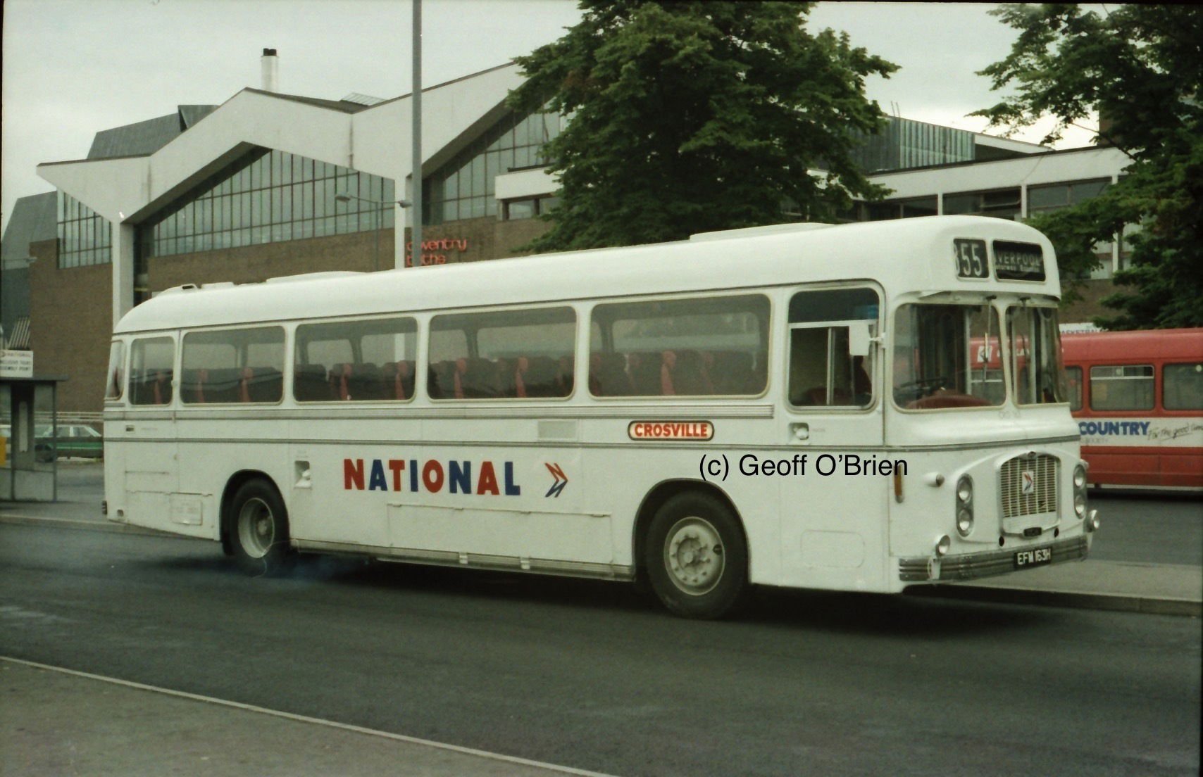 CRG163 is seen here in the NATIONAL ‘white coach’ livery and branding.
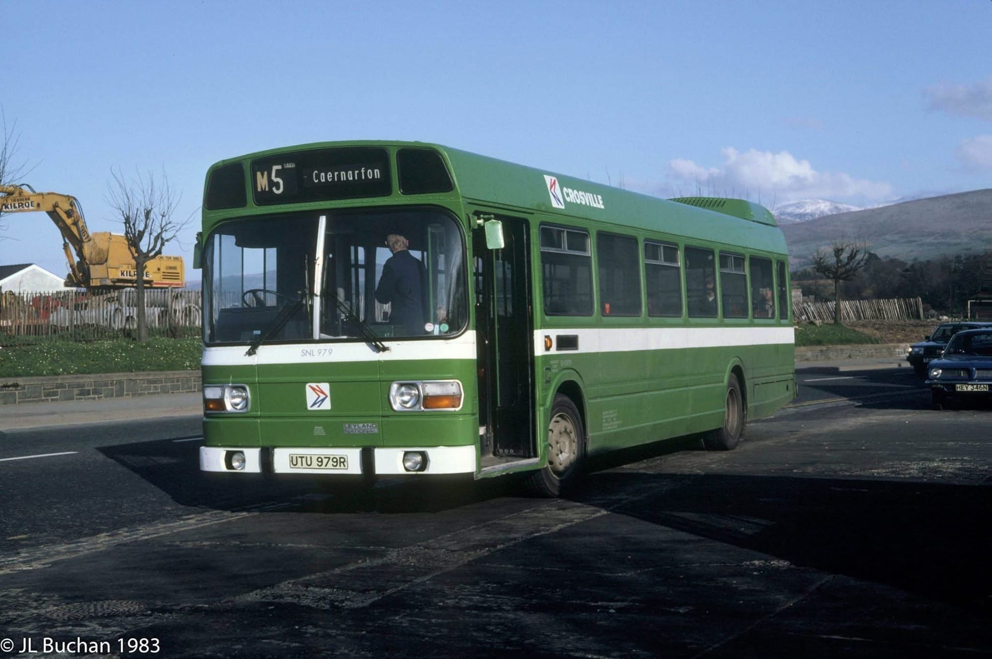 in the NBC bus livery consisting of the company house colour and whist waist stripe is Leyland National, SNL 979 (UTU979R) seen in late afternoon sunshine on 9 April 1983 on the apron of the company’s Bangor depot on Beach Road.
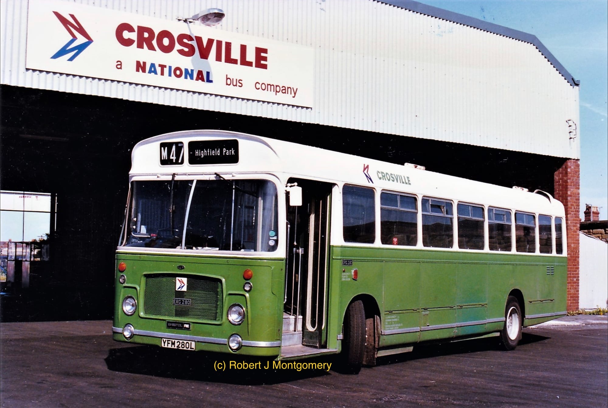 Crosville dual purpose ECW/Bristol RELL, fleet number ERG280 at the company’s Rhyl depot on 26 July 1986, three months before deregulation. Dual purpose vehicles were fitted with semi high back coach seats and used on a variation of services from local to more express/limited stop type services. Such vehicles with NBC were signified in this two tone livery of white and company colour bennaeth, red, green, blue or yellow with the fleet name and NBC logo on the roof line. An NBC logo would also be placed on the front grille of vehicles and rear above the windows.
Implementation and Impact
The logo and livery were detailed in Wilson’s NBC Corporate Identity Manual (1972, updated 1976), which provided precise instructions for their application across a vast range of vehicles, from double-deckers to the new Leyland National single-deck bus. Wilson’s team worked with coachbuilders to ensure uniformity, specifying logo placement (e.g., aligned with the rear wheel arch on double-deckers) and color use. The manual’s strict guidelines led to the nickname “identity police” for NBC headquarters staff, who enforced compliance, with Wilson himself reportedly frustrated by incorrect applications during his travels.
Wilson’s corporate identity was rolled out in April 1972, debuting with the “white coach” livery for National Travel (later National Express) coaches. These coaches, painted in unrelieved white with the double N logo and “NATIONAL” in red and blue, marked a radical departure from the varied liveries of regional subsidiaries. The white coach became a symbol of a modern, national network, leveraging the new motorway system to offer consistent express services. Local buses followed in July 1972, adopting vibrant poppy red or leaf green liveries, with the double N logo and fleet names in white.
The double N logo was not without controversy. Some local managers and engineers resisted the loss of traditional liveries, like those of City of Oxford or East Yorkshire, viewing the standardised red and green as bland. Interim measures, such as applying cream logos to older liveries, were phased out by late 1972 due to Wilson’s insistence on consistency.
Some criticised the red and green bus liveries as monotonous compared to the varied heritage colours, and the white coach livery, while striking, was prone to showing dirt, a practical concern for operators.
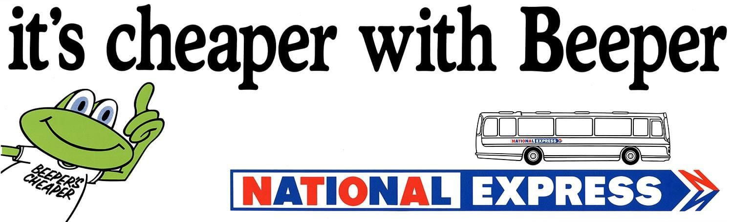 The beeper advert introduced.
Despite these challenges, Wilson’s design was a commercial and cultural success, with the logo becoming a powerful symbol of NBC’s modernisation which grew into a national coach network rivalling British Rail. The logo’s simplicity and memorability made it a standout, enduring on National Express coaches until 2003, long after the NBC’s privatisation in the 1980s. The corporate identity also supported NBC’s marketing efforts, with the white coach becoming a symbol of modernity and accessibility, particularly for long-distance travel.
Wilson himself was reportedly vigilant about his design’s application. Anecdotes suggest he was frustrated by incorrect logo placements or color deviations spotted during his travels, reflecting his perfectionist streak. His collaboration with Frederick Wood and NBC’s leadership ensured the project’s success, but Wilson’s role was primarily as a designer, not a public figure, and he remained behind the scenes compared to Wood’s prominence.
Broader Contributions and Design Philosophy
Beyond the NBC, Wilson’s work exemplified the principles of modernist corporate design. His emphasis on grids, typography, and color systems aligned with the Swiss Style and the work of designers like Josef Müller-Brockmann. The NBC Corporate Identity Manual was a landmark in British design, comparable to manuals produced for major airlines or railways, and its influence extended to other transport branding projects. For example, the manual’s structure and clarity inspired later UK transport identities, such as British Rail’s rebranding under the Design Research Unit.
Wilson’s firm, Norman Wilson Associates, likely undertook other corporate design projects, though specific examples are less documented. His Croda work suggests versatility, blending photography with type, while his NBC project focused on scalability and uniformity. His ability to distill a complex organisations identity into a single logo and colour scheme demonstrated a rare combination of creativity and pragmatism.
Legacy
Norman Wilson’s double N logo remains one of the most recognisable symbols in British transport history. Its longevity, used by National Express for over 30 years, underscores its effectiveness. It outlasted the NBC itself, which was broken up and privatised between 1986 and 1988, and continued to represent National Express until a rebrand replaced it with a new logo in 2003.
The history of National Express is available on this website by clicking HERE.
Wilson’s work is preserved in archives like the Manchester Metropolitan University’s Special Collections and celebrated in projects like the reissue of his Corporate Identity Manual. His influence extended beyond vehicles to uniforms and signage, shaping a holistic brand that left a lasting impression on the UK’s transport landscape.
Wilson’s double N logo is a testament to the power of thoughtful design in unifying a fragmented industry and projecting a forward-looking image. Its enduring recognition, as seen in nostalgic recreations underscores its place in British cultural memory.
Personal Life and Later Years
Little is known about Wilson’s personal life or later career, as he did not seek the spotlight. He likely continued working in graphic design through his Manchester-based firm, but no major projects after the NBC have been as widely documented. His collaboration with Frederick Wood suggests a professional network spanning industry and design, but Wilson’s focus remained on the work itself. He passed away in 1991 sadly, however his legacy is primarily preserved through his designs and their impact.
Cultural and Historical Context
Wilson’s work for the NBC coincided with a transformative period in British transport. The 1960s and 1970s saw the rise of motorways, the decline of rail travel, and the growth of car ownership, challenging bus and coach operators to modernise. The NBC’s formation was part of broader nationalisation efforts under Labour governments, aiming to streamline and control public services. Wilson’s design responded to these trends, aligning the NBC with the era’s modernist aesthetic, seen in everything from architecture to product design.
The double N logo’s arrow-like form may have drawn inspiration from earlier transport symbols, such as the London Underground’s bar-and-circle logo or British Rail’s double arrow, though no direct link is confirmed. Its success lay in its adaptability, working equally well on a Leyland National bus, a coach ticket, or a roadside sign. Wilson’s ability to navigate the NBC’s complex stakeholder landscape further underscores his skill as a designer.
Conclusion
Norman Wilson was a visionary designer whose work for the National Bus Company redefined British transport branding. The double N logo, with its elegant simplicity, unified a fragmented industry and became a cultural icon. His NBC Corporate Identity Manual set a standard for corporate design, while his National typeface and bold liveries captured the spirit of 1970s modernity. Though less is known about his personal life, Mr Wilson’s legacy endures in the archives, nostalgia, and ongoing appreciation of his work. The double N logo remains a testament to the power of design to shape public perception and national identity.
the modernist Layout 44
The Modernist magazine is a sophisticated publication dedicated to the exploration of modernist architecture, design, and urbanism, championing the principles of simplicity, functionality, and aesthetic clarity. It features a curated selection of articles, stunning visuals, and interviews with leading architects, designers, and thinkers who shape contemporary built environments. Each issue highlights innovative projects, from minimalist residences to forward-thinking urban plans, emphasising sustainable and human-centred design solutions. With its clean layout and intellectual depth, The Modernist appeals to professionals and enthusiasts alike, inspiring a deeper appreciation for modernist ideals in addressing the challenges of modern living.
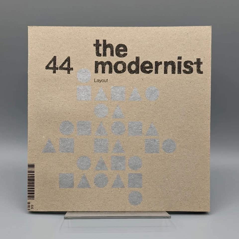 An image of issue 44’s cover from the-modernist.org website.
The Modernist magazine, issue #44, themed “Layout,” delves into the principles of modernist architecture and design, focusing on 20th-century aesthetics. This issue explores how modernism seeks to bring clarity and coherence through structured design, inspired by Le Corbusier’s idea that “to create architecture is to put in order.” It features articles on the disciplined yet innovative approaches to layout, including Amrit Randhawa’s analysis of Karl Gerstner’s design genius, Sarah Hardacre’s exploration of Keith Coventry’s Estate Paintings, Laura Coucill’s unique look at the aesthetic of manhole covers and ‘Norman Wilson - A Manchester Modernist by Richard Price’. With 72 pages of black-and-white and color content in a 200mm x 200mm perfect-bound format, the issue celebrates both rule-following and rule-breaking in design. Published by The Modernist Society, a not-for-profit organisation, it’s available for purchase or through subscription at the-modernist.org.
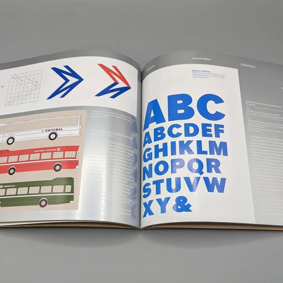 A sample of some of the pages covering Norman Wilson and the NBC from the-modernist.org website.
Issue 44 can still be purchased. For further detaild please click HERE.
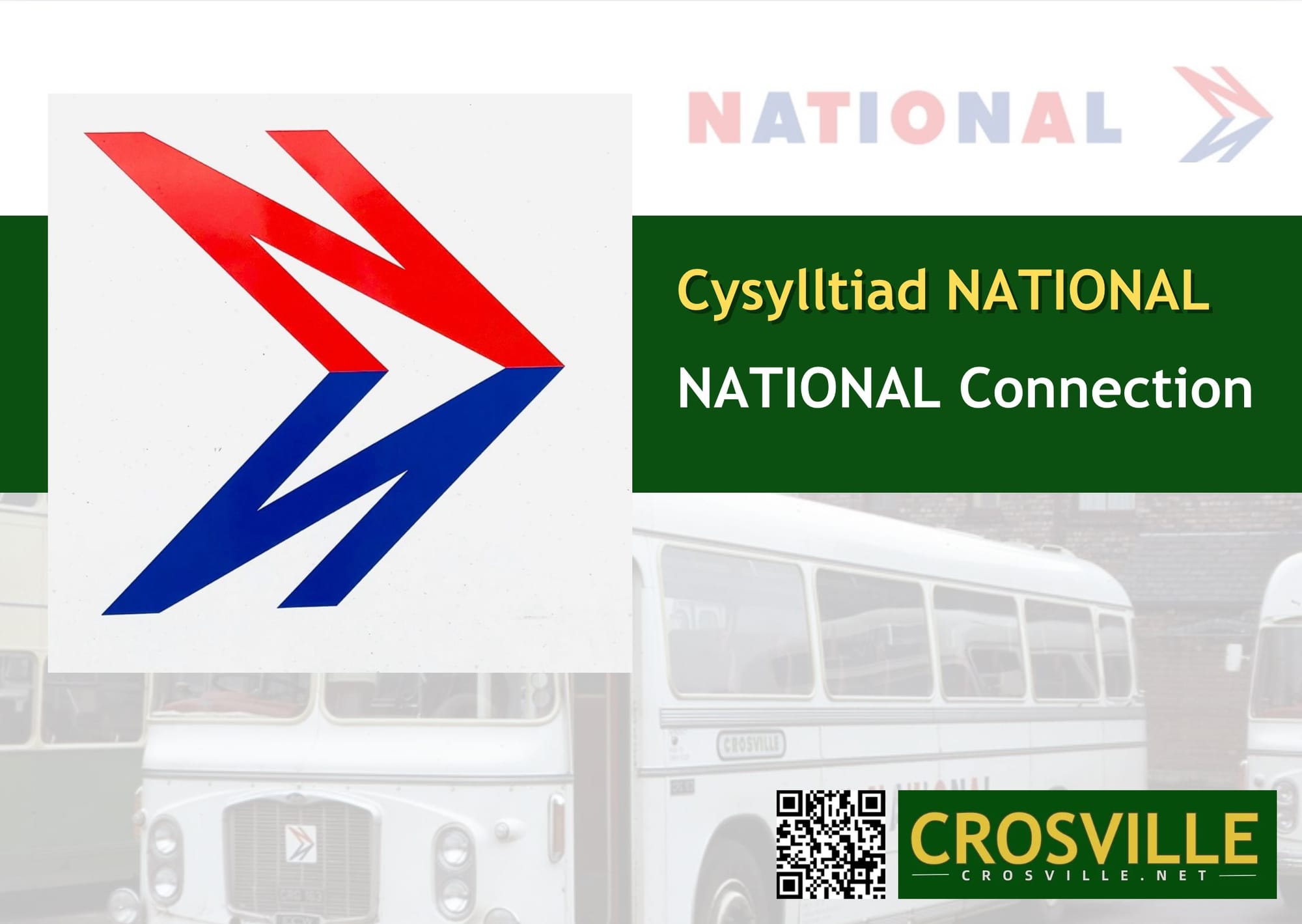
The National Bus Company Corporate Identity Manual via nationalbusmanual.com
This is a wonderful website that is dedicated to a project aimed at producing a replica of the National Bus Company’s (NBC) Corporate Identity Manuals, originally issued in 1972 and 1976. It has been put together and led by Richard Price at the NBC Corporate Identity Manual Project in association with the Bus Archive. It serves as a hub for enthusiasts, designers, and transport historians interested in the modernist-inspired design of the NBC’s corporate identity, shaped by Norman Wilson’s vision.
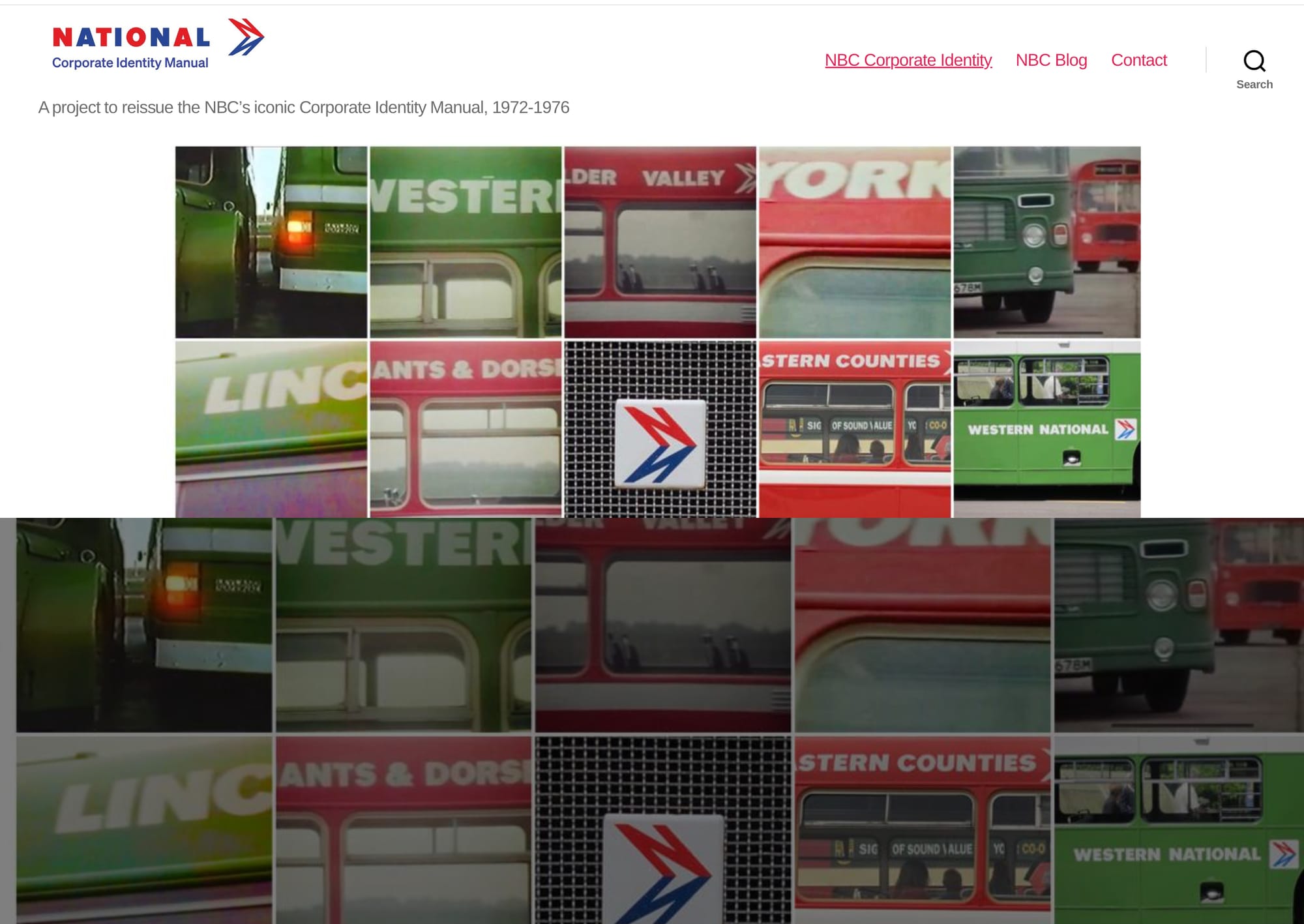 The homepage image of thenationalbusmanual.com website. Click on the above link to take you to the site.
The site features a blog with regular updates on the project’s progress, detailing the challenges of tracking down original manual pages and archival materials, as well as insights into the NBC’s iconic design elements—bold colours, a distinctive typeface, and a monochrome symbol—all unified in a grid-based layout. Visitors can explore posts about the identity’s rollout, its application across diverse vehicle types, and its cultural significance, with contributions from experts like Ray Stenning and The Bus Archive.
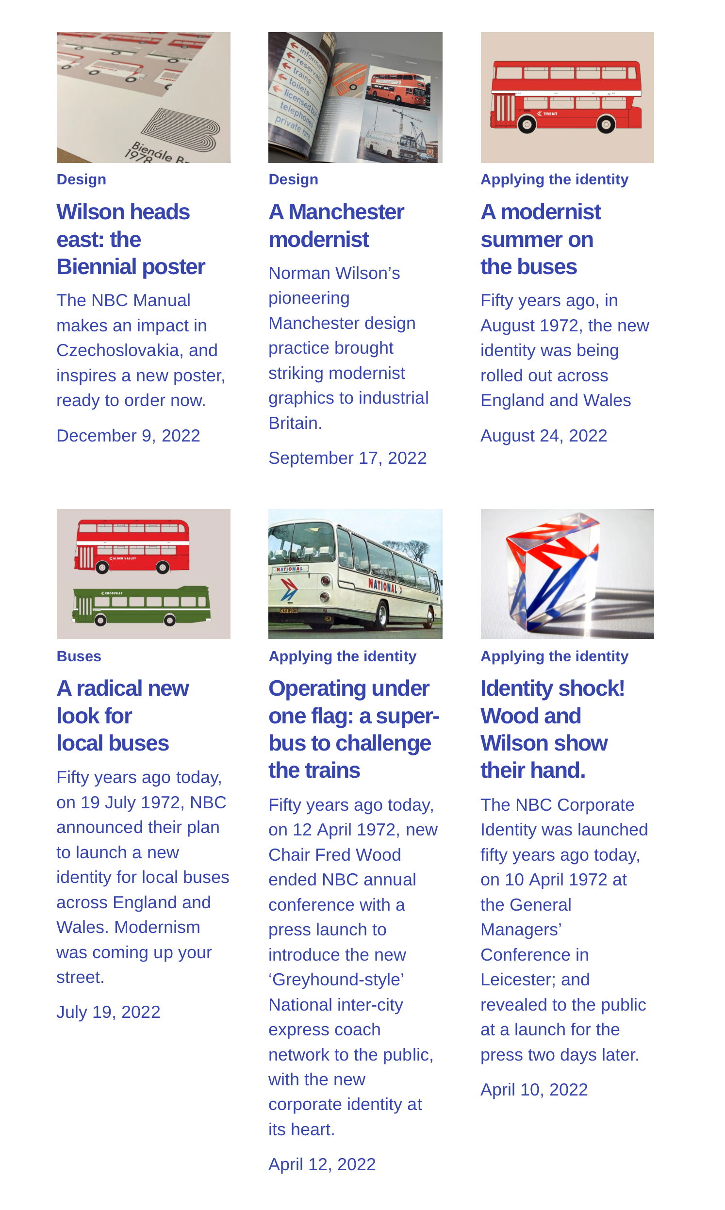
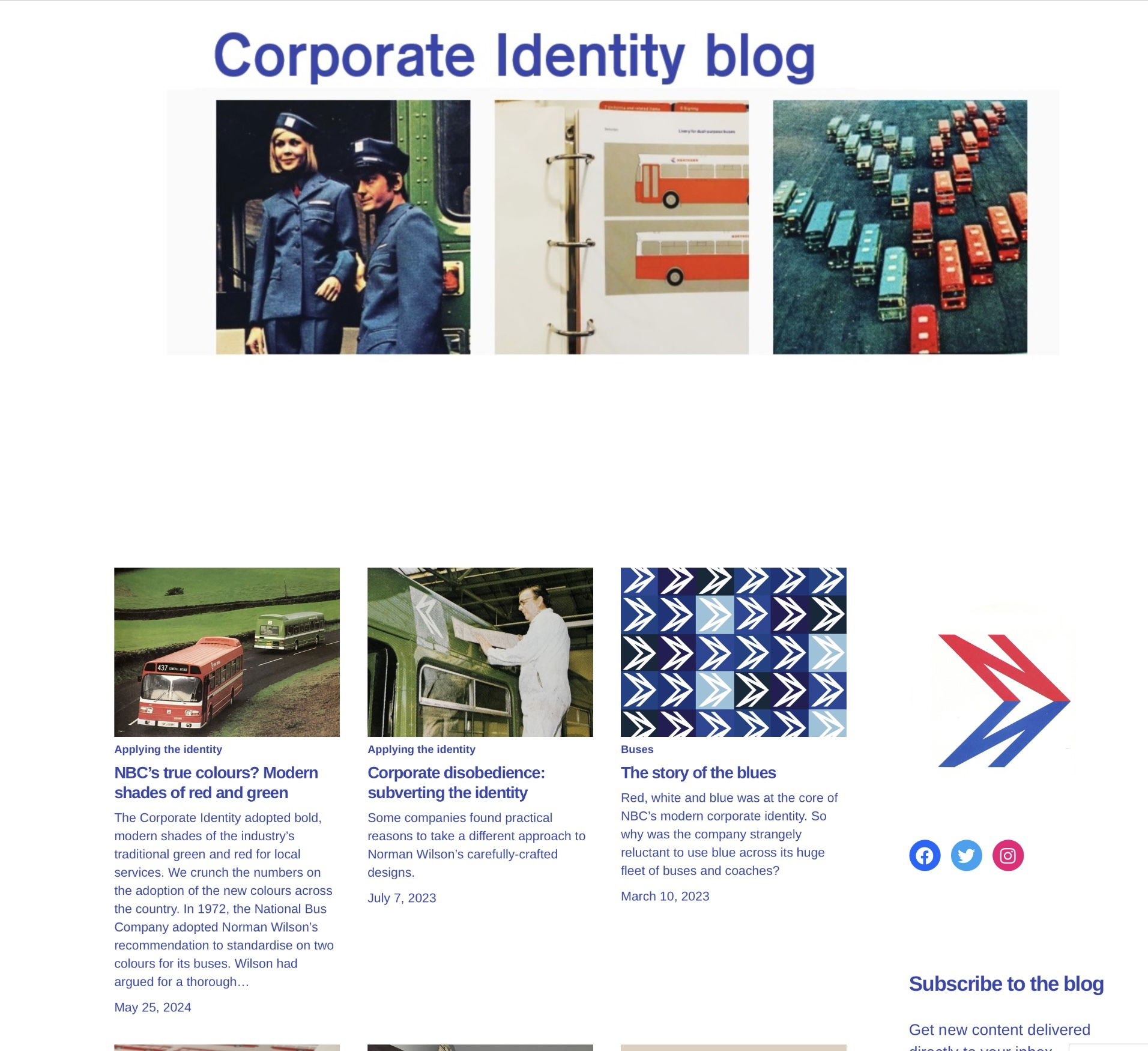 An image of the Corporate Identity blog page from thenationalbusmnual.com website. Click on the above link to take you to the site.
The website encourages community engagement, inviting recollections and materials from those involved in the NBC era via a contact form, email (nbc@nationalbusmanual.com), or social media (@busmanual on X (formerly known as Twitter), Facebook). It also highlights related publications, such as an article in The Modernist magazine’s issue #44, emphasising the project’s connection to broader modernist design discussions.
 Another image from the fantasticthenationalbusmnual.com website. Click on the above link to take you to the site.
The National Bus Company Corporate Identity Manual website nationalbusmanual.com is truly fascinating and magnificent website that is well worth the visit and read! Immerse yourself in all things National Bus Company.
With grateful thanks
With grateful thanks as always to John Buchan and Robert J. Montgomery on being able to include their wonderful images on this website. Thank you.
Contact details
There are some photos on this website where copyright is unknown. If these photos are yours then please let me know by e-mailing post@crosville.net so that they can either be removed immediately or copyrighted to your name accordingly. Thank you.